Bipple provides savings and investment tools in an accessible and intuitive product. Young people are often neglected in the current fintech landscape, I designed Bipple with students and graduates in mind.
Executed the complete product life cycle from ideation and defining target users and goals to branding a complete customer experience.
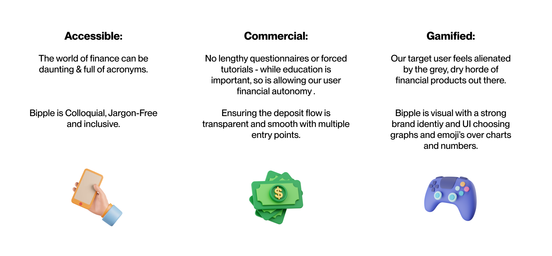
Bipple had three key objectives that I held at the front of every decision throughout the design;
Using these goals as a springboard I was able to carry out my research with direction and purpose - mapping out the most valuable features for young professionals and students.
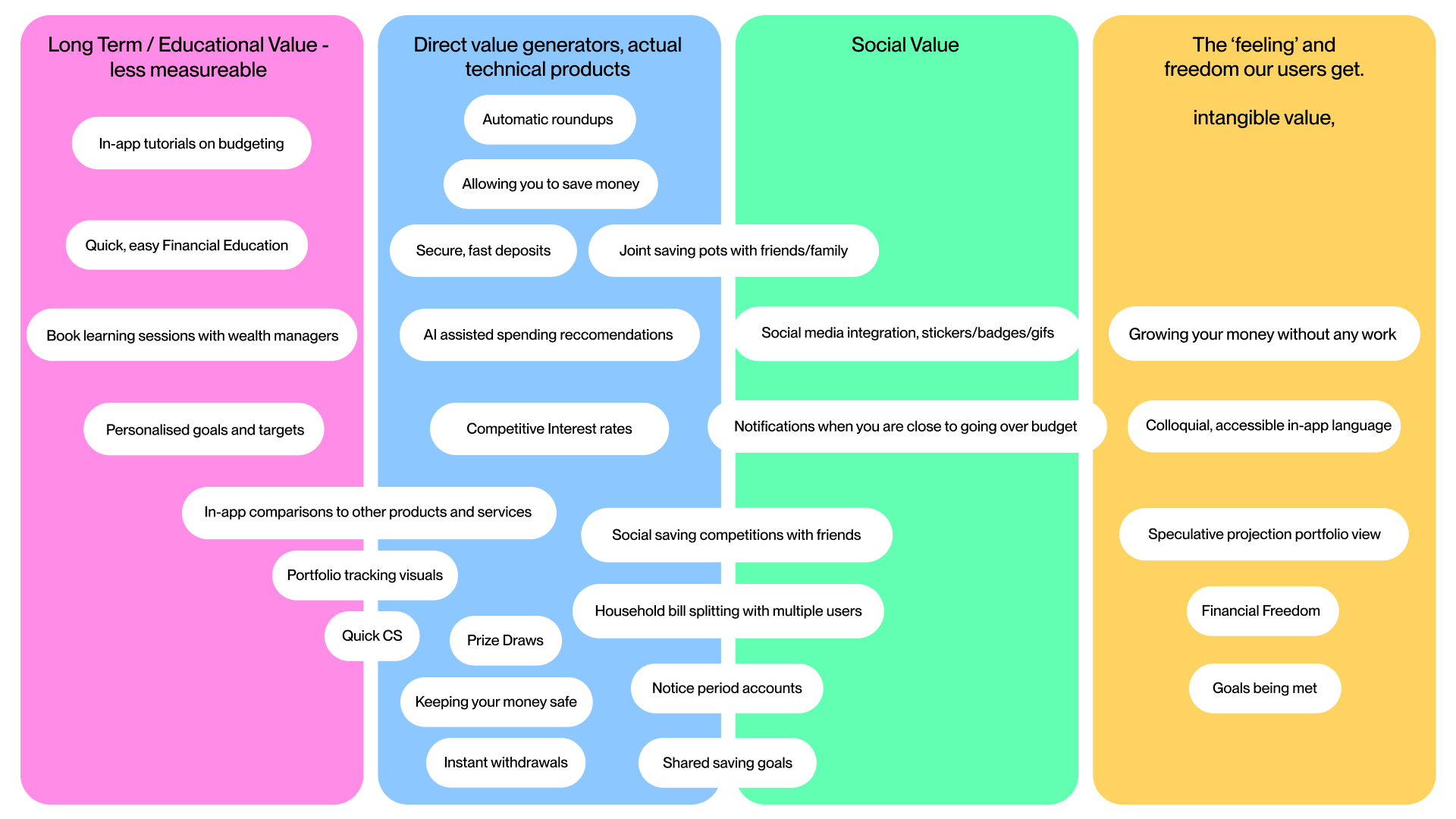
User journey maps based on personas provided technical answers to the goals I set, pairing product features to user needs. Adding in-app context to my project goals allowed specific, actionable research sessions on lo-fi prototypes
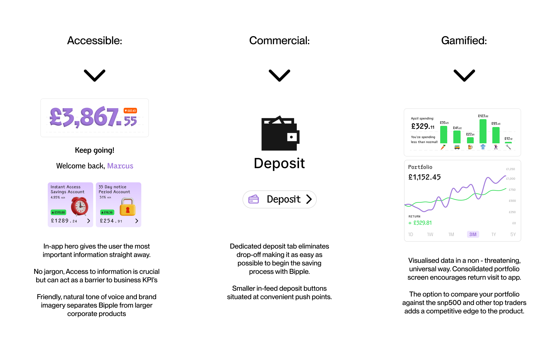
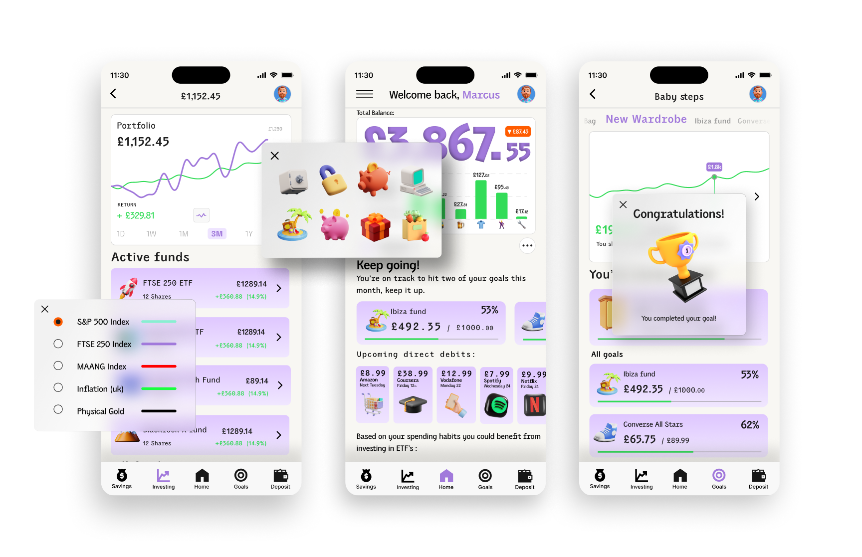
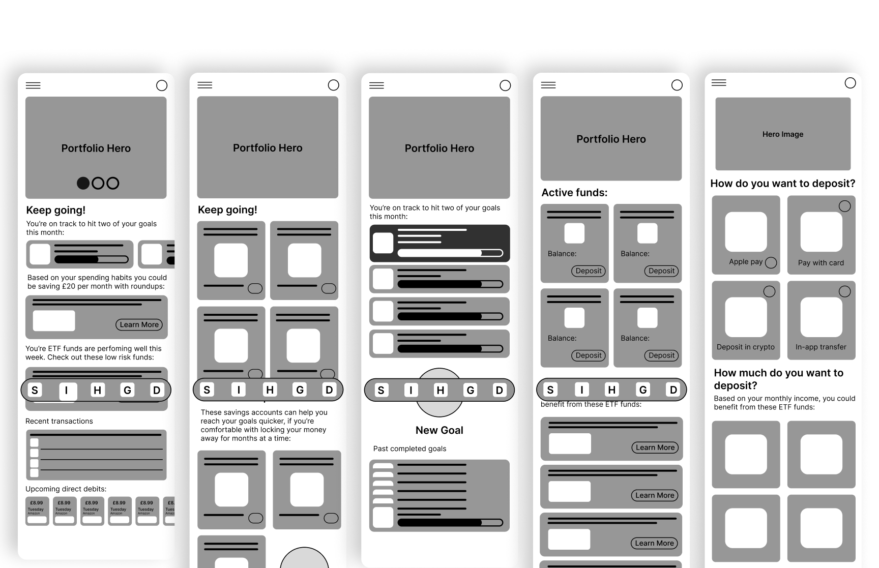
From a series of prototypes, I landed on a tab-based app architecture, that allowed the user to easily access and monitor different avenues of their financial life: Saving, Investing and goal setting.
Additionally, there was a deposit tab to reinforce our goal of making saving money as easy and accessible as possible - keeping the deposit function front of mind in the nav bar. A consolidated portfolio view and ‘home’ tab showing snippets of all the other tabs adheres to the other objective of gamification and visual data story-telling.
Additionally, there was a deposit tab to reinforce our goal of making saving money as easy and accessible as possible - keeping the deposit function front of mind in the nav bar. A consolidated portfolio view and ‘home’ tab showing snippets of all the other tabs adheres to the other objective of gamification and visual data story-telling.
The user research sessions clarified a need to improve three areas of the experience:


I learnt that people want to see their money working for them, and how it is progressing. I designed a system of graphs and portfolio/spending charts to track users PNL in an easy to register format. These charts were positioned as hero images so the user has access to them instantly. This helps hook the user with a progress related dopamine hit upon opening bipple.

We could provide additional value by displaying customisable price charts for each tab. This helps users see how their portfolio is performing against real world assets and funds. I made the features culturally relevant with celebrity trade tracking and line graphs - combined with social proofing with friends and family PNL lines too, to promote referral.

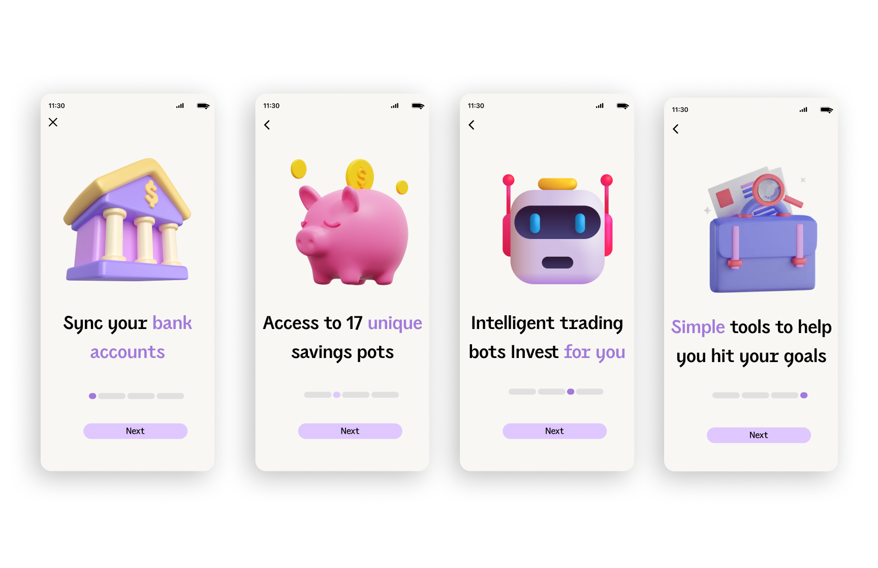
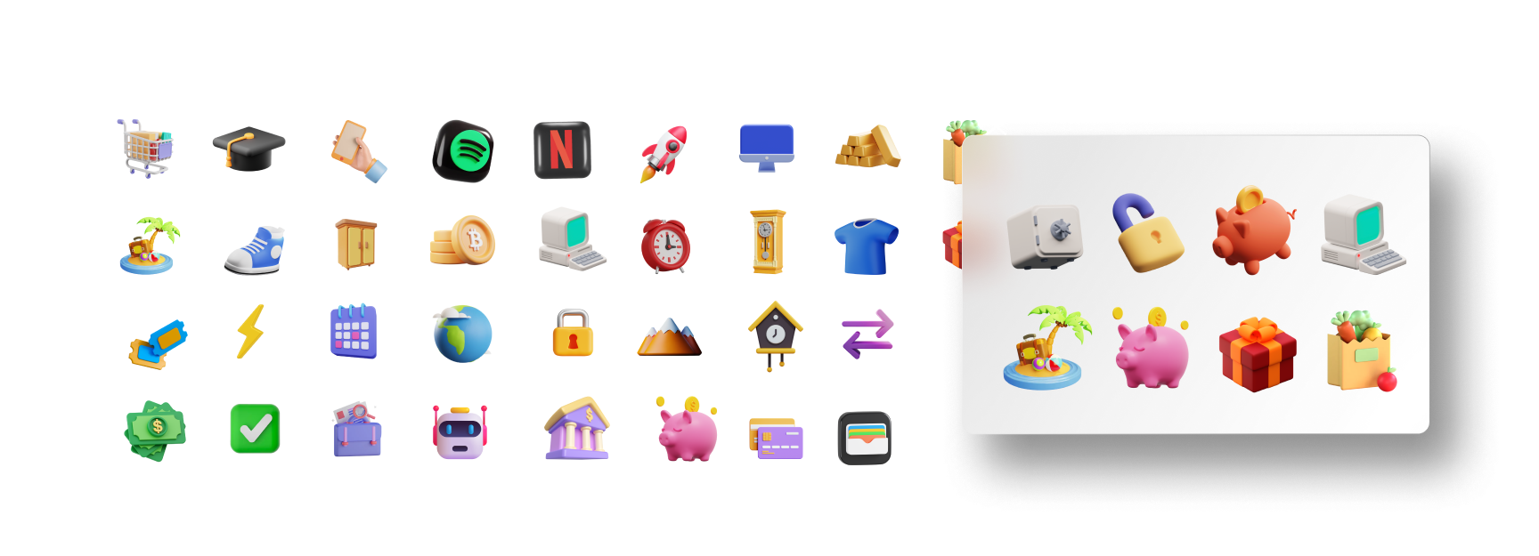
Barriers to entry were removed by using friendly, playful human 3d renders.These remained an integral part of the UI and brand identity from the onboarding flow right through to the deposit screens:
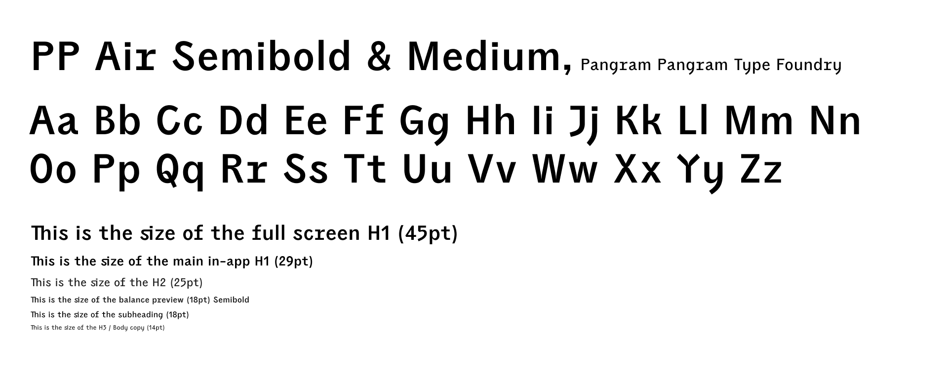
After trialing many, many fonts, I finally settled on an irreverent, friendly sans serif by Pangram Pangram. It scales well and follows the brand ethos of non-corporate and unthreatening.